#I was playing with perspective and then I was playing with the Krita brushes
Explore tagged Tumblr posts
Note
hiiii just wanna start off by saying I love your art style and general vibes ✨️ I'm a stay-at-home partner always in search of fun things to do, and I've recently gotten back into art after not engaging with it since I was a kid (largely because your sun n moon fixation rubbed off on me 😭). I've never tried digital art and it looks cool! Do you have any advice for a beginner like me?
Oh it makes me so happy when people say I inspired them to start creating again 😭 The DCA and the fandom brought me out of my own years-long artistic funk last spring. Clown power, yeehonk 🤠 🤡
I’m planning a significantly longer post in response to an ask I got ages ago all how I learned to draw the way I do, so lookout for that.
But in the meantime, here’s a couple things I can think of off the top of my head:
Specific tools don’t matter much. I currently use Procreate and would recommend it if you have an IPad. It’s an extremely simple but effective program.
On desktop, I use Clip Studio Pro, but Krita is another program I’ve used and liked AND it’s completely free.
I do also have loads of experience with Photoshop and other Adobe products but can’t recommend them at the price, not to mention they’re not super beginner friendly.
Hardware-wise, I almost exclusively use my IPad to draw because it’s so portable. I also have a Huion Kamvas pen tablet monitor that hooks up to my desktop. But I started doing digital art with a dinky lil Wacom tablet that was less than $100. There’s definitely a bit of a disconnect at first, not looking at where you’re drawing but rather on a screen, but you get used to it.
Bottom line is to use whatever tools are convenient and comfortable for you! I even know of a great artist that exclusively draws with their mouse. I realized I hated sitting at a desk and that stopped me from practicing digitally. I got an IPad and now it’s much easier for me to work comfortably on what I love.
Point two I’d like to make is take advantage of the capabilities of working digitally. This means using the godsent undo button to your heart’s content. Download fun brushes to play with and add texture. Use perspective grids. Turn on line stabilization so your strokes are extra smooth. Like what you’ve sketched so far but want to try something different? Duplicate the layer and work from there so you can go back to the old version if you change your mind. Radically change the colors or values with adjustment layers. Use clipping masks. Abuse the liquify tool.
A lot of this might sound like gobbledygook to a digital art beginner but just googling any of this terminology will get you loads of tutorials and information for your specific setup. Also I’m happy to go into details about specific digital art techniques I’ve picked up with over a decade and a half of experience.
Finally, and most importantly—make what you want to see in the world AND what feels good to make. This ofc is not exclusive to digital art, but I always want to stress this to new artists. I realized after I got into the DCA fandom that I had been letting shame, fear, and perfectionism keep me from creating the content I was really interested in making. But then man, idk. Frickin’ robot clowns amirite ¯\_(ツ)_/¯ it’s like there was a secret agent sent into my brain and he uploaded a DCA virus into my mainframe or smth idk hacker style. tktktktkt. they’re in.
Anyway. Hope this helps! Feel free to send another message if u have more questions :3
15 notes
·
View notes
Text
Some of my early undirectioned stuff
This is just a simple post to show some of the early drawings I made before I decided to try taking a course. The images are not in a particular order, and there's a lot of stuff I don't have here that I ended up deleting as I didn't see value in keeping.
First is a painting I titled "Sunrise by Imil"
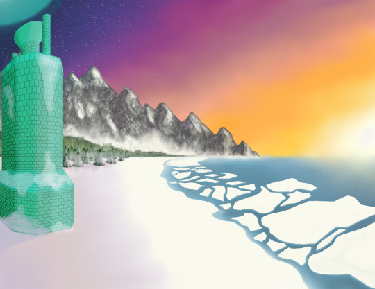
This started as a perspective practice with the usual "draw a box on 1, 2 and 3 point perspective"; but then slowly evolved into something that I wanted to see detailed, finished and such. I wanted to have a wintery landscape to show my players a vision of the world they inhabit. They visited Mercury Lighthouse a long while ago, and was a place that I don't feel like I left the impression on how eerie and out of place, yet absurdly natural felt. I would've loved to have this ilustration back then, to show my players a visual of where they were going, rather than a simple explanation of the area.
I also used this piece to get familiar with the brushes and customization tools that Krita offers. I learned a lot about texturing, layers, brush packs and other things with this piece. I'm happy about how it turned out, but feel like there's a lot of things that can definitely be improved.
Second we have a Chikorita fan art.
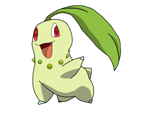
I wanted to draw something for my GF, and use that as a excuse to practice shaping and sketching. Chikorita was her starter when we played Pokemon HG/SS on a dual run, and she remembers fondly her "Kory", as she nicknamed it. I started strong with the sketch and felt like the shape was pretty much nailed, but as I got to detailing the line art, I found it hard to make the lines not feel wobbly. I need to practice more on my line smoothness.
Then we have Untitled piece #1, a shape practice sheet.
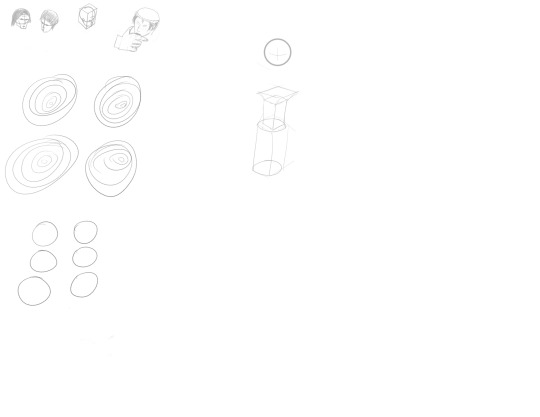
I actually had a lot more of these back when I first plugged the tablet to my PC. I used these sheets to practice lines, shapes and circles (you can see a lot of the circles). I was also trying to practice some shape forming into faces, as some video I saw taught me how. I don't really like the results, and feel like there's a lot of room to improve, but as this was literally 24 hours into my drawing hyperfixation, I think it has a place here. You can also see some early concept for the Lighthouse on the center of the sheet, which in turn came to be fully fledged on the first image of this post.
And that's all I have available to export now. I thought I had more pieces to show, but I guess those will come with time.
Will certainly upload more as I continue the course.
8 notes
·
View notes
Text

I'm playing around with contrast and composition, and also seeing if I can speed up when it comes to rendering backgrounds. The perspective and vector tools in Krita really helped for the layout on this one. I also took advantage of texture brushes, although it doesn't really show in the final image. I have more practice when it comes to cohesive scenes, but all that perspective drilling is really paying off when it comes to interiors!
#digital art#artist on tumblr#own art#character illustration#oc#rook#dnd#dungeons and dragons#rp#castle
0 notes
Text
My Drawing Process
So, finally getting around to sharing my process. I feel so bad that this took so long to finally do, but better late than never? Also, please bear in mind that I am mostly self-taught, so if I'm doing things funkily, that's probably why.
This is gonna be a long post, so I'm putting it under the cut.
First step is gathering references. This takes… So. Much. Time. Because it never feels like I can find the ideal one for what I'm picturing in my head? (Also, because I end up distracted and gathering ones I don't need, but the ADHD is strong in this one.) I usually end up using multiple references for various aspects and kind of Frankenstein-ing them together (like, one might involve the initial placement of two figures hugging, but then I'll find another to place an arm differently, or to help depict a different body type than the first reference. Oftentimes this involves using the "perspective" feature of "transform a layer or selection" on Krita for positioning a reference.)
I tend to keep different linework in various bright colors to help myself differentiate between them, keeping several separate layers, and later merging (and ideally labelling) them. For example, I'll have several hair layers as I add details and whatnot, and will only combine them into one layer once I'm satisfied with how everything looks. Linework involves a bunch of redrawing for me as I play around with things to get them to look the way I want, so I make a bunch of copies as I tweak different lines in case I bork something up and need to revert to an old copy (I'll periodically go through and delete old copies as I improve said lines.)
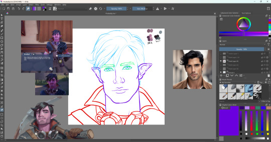
This is the point where I'll color my lines black, though if it's difficult to differentiate between certain lines, I might leave certain lines colored until the flat colors are done.

Next is getting my flat colors done, usually taking from the original color-scheme if it's fan-art of a non-original character. I usually keep a little labelled swatch like the one in the upper right.

Then we get to the fun part that I hate and love in equal measure: shading and highlights!
I'll usually start with adding pink-ish tones to the areas that have the concentration of blood-flow- cheeks, tip of the nose, etc. (Though, I don't think I did with this one, so I don't have an example to show, oops.) Then I'll move onto shading, following a reference typically for a basic idea of where the contours need to be, but a lot of this ends up being intuitive. I like to use a combination of the wet paint brush, the soft airbrush, and the basic blender- often setting it to a lower opacity as I blend/soften edges and switching the eraser setting on and off. I try to move my brush strokes in directions that follow the shape of the contours themselves - as if it were a 3d model (does the way I'm describing that make sense? I hope so.)
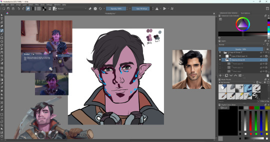
I like to play with different filters on the layer setting to get the color/concentration I want for this - "Shade - IFS Illusions" gets used a lot, though typically set to less than 50% transparency and often in combination with another lower transparency layer or two, I play with layers to get the looks I want.
Post-blending:
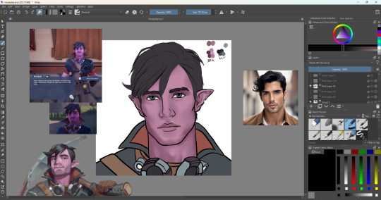
Then adding extra details- in this case, slight creases and stubble, etc.

Then highlights- I love using the "Luminosity/Shine SAI" layer filter for this- gives it a nice glow. Same as before, I might have several layers for highlights, at various transparencies to achieve a certain look.
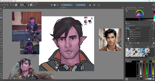
Then I'll add more details, usually focusing on things like clothes.
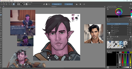

Then the background. I do not love doing background stuff, but I am very grateful for finding FizzyFlower's Essential Brushes- it has sooo many helpful brushes.
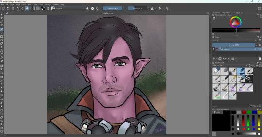
Annnd that's about it. I hope it was helpful and not too rambly.
0 notes
Text
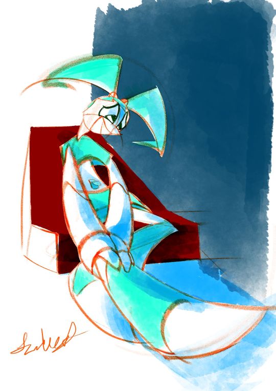
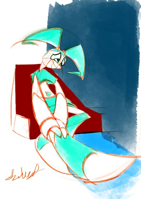
2024-01-07 Jenny holding leg in intense worry 😢
Art Timelapse
Thumbnail Timelapse
Art, plus a shadowed version & two thumbnails.(imo, I like the un-shadowed version better, but the shadowed one's starting to grow on me.🙂)
Based off a spur-of-the-moment thumbnail. In the middle of making it, I interpreted it as she’s not feeling “pain” per se (since she doesn’t have nerves); more like slight pressure that she’s cautious could burst.😔
*So sorry!🙇♀️Between getting ‘rona again & readjusting, I took a longer break than I intended. Guess this drawing of worry is kinda subconscious😳…Now that I've ruminated on it, it's okay🙂. This was a work-life balance lesson in managing forced breaks (like sickness).
MINI JOURNAL
This was another piece I was exhausted with. Another was the “Jenny slightly pulling back” one. While this “Jenny tending to leg” was over a week, it almost didn't feel any less concentrated with exhaustion.😔Anyways, in both cases, I didn't have too clear of an idea of what the final piece would look like (less so with this new one, as I knew I wanted to keep most of the lines red-orange & color Jenny aqua-green).
Social Media Strategy Tweak
Maybe next time, when in doubt, just keep it a sketch, with no colors or tones??? Tbh, I didnt go that route bc I didn’t want a piece that was too harsh on the eyes from being over a bright white background, but at least a softer white. …Now that I've written it out, it sounds like a dumb reason.😥
Or, was afraid that wasn’t finished enough for IG/social media? Maybe, especially since I wanted to have a red-orange pencil-sketch style in there. Maybe be a little more elaborate & have black cleaner ink lines & grey base tones (like your ‘quick traditionally-styled storyboard’ art style)?
Wait, I just remembered: could do sketches, but do that Natalie Nourigat “draw the pose 5 times” exercise.
The exception will be the Jenny Injured diptych (to still be colored but not further pushes gesture-wise (tbh, I again want to try to get done as quickly as possible)...plus, I'll just say, “something different.” 😉
Personal Preferences & Little Backburner
Imo, I like the shadow-less version. Jenny's legs contrast better with the background, and the colors are closer to what I ended up having in mind.
Yes, even the unconventional red-orange linework with cyan base colors😄. I’d actually been meaning to try that out on a piece; tbh, I just like red-orange/vermilion-colored pencil sketches.😊 I was doing another red-orange pencil, Krita sketch in October that I wanted to try that color scheme on, but the perspective needed retooling.😵💫
BTS
I actually had this, along with a thumbnail for a completely different piece, on the backburner. While I wanted to do the other one, I went with this more unclear-looking one. That way, I could finish it before I forgot what I had in mind.
After I was well into the finalized sketch, I found a 2nd, more pushed-gesture version of one of the thumbnails. That’s when I decided to try not to spend too much time on this piece; I wanted to re-do it with this pushed gesture.
Also, after a while of using one of my go-to Krita watercolor brushes from last time (WaterC Flat Decay TIlt), I got really mentally exhausted. Played around with doing the painting stage in Adobe Fresco, but despite Fresco’s watercolor brushes feeling far more comfortable, I wanted to keep this artwork quick. Therefore, I just continued the painting in Krita.
Oh, and instead of erasing the extra pencil lines, I covered most of them up with white.
Plus, that monitor profile changing fixed my colors after all!😊 I’ve gotten my solution written down somewhere. I’ll try to post it sometime.
SELF CRITIQUE
(-) Iffy depth on the navy-blue block of color
(-) Mouth kinda looks like she’s smiling???
(+) Good foreshortening on Jenny & the chair
(+) Great gesture/line-of-action into the hurt leg; decently faithful to thumbnail’s gesture. Improvement from that in “A Place of a Contemplating Robot”
Shadow-less version
(-) L hand [our POV] gets lost in the sticking-out leg
Shadow-ed version
(-) Sticking-out leg disappears into the ground
(-) L arm should have harder edges on the shadow
(+) L hand has hard-edged shadows
(-) Bent leg’s foot also has too soft of shadows
ART SUPPLIES
Hardware: Alienware x14, Huion Inspiroy H610PRO V2 pen tablet, & IMAGE Light Pad Stand A3
Software: Krita (art & timelapse), Autodesk Sketchbook (thumbnail & its timelapse)
Brushes:
(v 1.1) Krita Redux- Pencil (AFresco) - linework & white cover-ups. Less-aliased version of my custom brush
j) WaterC Flat Decay TIlt - hair, ”clothes”, belly button base colors, BG block, ground
(Dig.) Clean-Up Lines (Aliased) - Jenny white matte & chair base color
1 note
·
View note
Photo

Kirigakure warm-up sketch that got away from me a little bit.
I like his hair. I like his colour palette. I do not like his chainmail.
#I was playing with perspective and then I was playing with the Krita brushes#Inazuma Eleven#Kirigakure Saiji#His chainmail broke my brain. Don't look too close at it the patterning is definitely trashed.#CK's art#Also that's not blood. Probably.#There is no visible Source Of Gore. I wasn't thinking any further ahead than Cool Splatter Effects and Red And Pink Palette.#It's probably red clay mud. This is Kirigakure The Dirt Boy.#And forgive any janky colours I got into my tablet's display settings and I don't know what I did or how to undo it#Everything is Ultra Hypersaturated on that screen now help
27 notes
·
View notes
Text
Art Progress
Here is a step-by-step of my drawing process. I use Krita on a Microsoft Surface Book 2 and I made myself a template for these illustrations using the same colours and brushes to complete. I feel that settling for a “style” like this helps me to focus on drawing rather than wasting time thinking about HOW I wanna draw. And from there, one can always break the mold. :D
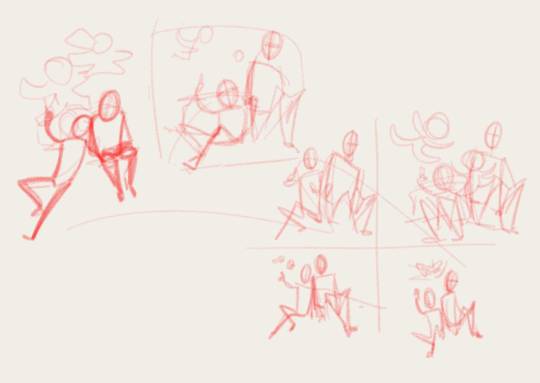
Step 1 - Base Sketch
Doodling the base pose with a pencil brush, just to get the general gist down. This is very small, actually, so I am unable to add details at this point. xD And who cares about anatomy or perspective, curves and balance are all that matter. Unless I have a distinct reference, then I use that as orientation.
In this case I just needed to find a composition that would show the paper dolls closer the viewer but still leave enough room for the two Dreyars to be fully visible, too.
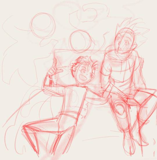
Step 2 - Sketch
Same brush. I just enlarge the base sketch and draw on top (new layer). Ideally perspective and proportions should be considered here, because obviously it just get’s harder and more frustrating trying to correct things later on. But when you hit your limit, proceed rather than dwell on your weaknesses. Nothing against learning and pushing yourself, but before your throw the towel out of frustration, continue. ;)
I had NO references, so the perspective is super wonky. I don’t mind such minor inaccuracies, as long as it’s not super distracting from the content.
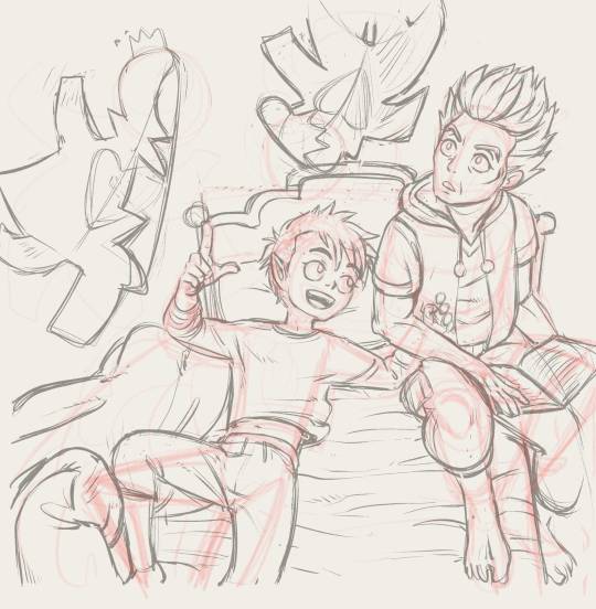
Step 3 - Pre-line Sketch
This is the step for references. I often take pictures of my own hand (or draw from life if I can) to get them right or I’d stare at pictures of whatever body part I have trouble with (arms, shoulders, muscles, you name it). I did throw my blanket around and copied from that, I opened some screenshots of young Makarov for his hair, face and clothes, I read up on Shikigami, thought about Ivan’s hair etc...

Step 4 - Lines
The FUN PART. If your pre-line sketch is fine (and it should be as fine as possible), go ahead and line this thing! I don’t like having to make up things at this stage anymore and want to keep adjustments at a minimum but if it really is necessary, one can still play around with head size/angle, eyes, hands etc. But still, the better the pre-lines the easier and more fun the rest of the image!
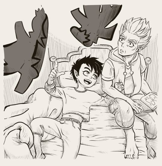
Step 5 - Shading/Details (lined)
I wanted to imitate Mashima’s way of shading using just fine lines but I am way more messy with it. The lines aren’t parallel and slim down before edges, I have thick and heavy lines, too. Knowing your light source is helpful so the shading is not all over the place, but I like keeping everything as simple as possible and do sometimes just use the shading to show that something isn’t flat. Depending on the complexity of the image, I will add greys in another step to add depth.

Step 6 - Flat Shading
The paper dolls were dark very early on, because it’s a good way to show something is closer to the viewer. But I still needed more focus on them (in hindsight, maybe even a blur would have helped?) so I used a flat coloured layer with opacity turned down to suggest a top light above the characters heads in an otherwise dark room. It sets foreground and background apart a bit better, giving another circle around the floating dolls, like a frame, that draws attention to them.
If needed I can use several such layers, for separate objects or more levels of shading.
And that’s it!
When I find a good way to colour these illustrations, I will share a progress as well. But what I coloured so far did not meet my personal standards at all, so I’d rather not dwell on those and move on. xD
29 notes
·
View notes
Text
quick comparison of free animation software
if you look for software comparisons you just get marketing copy and feature list. this is like my actual experience using them as a beginner hobbyist animator...
krita
Krita has a fantastic brush engine and painting features - which you’d expect since it’s a painting program first. I’ve basically always come back to it, albeit in a hybrid workflow with Blender (see below). This is a big advantage for e.g. painting backgrounds in the same file as the animation frames, or having more complex painted animation frames than you can do with cels.
Compared to the other software, Krita’s animation features are a bit limited, though not terrible by any means. You do have: onion skinning per layer, and a reasonably intuitive timeline for moving frames around on each layer. It can also play back and render frames pretty well.
However, there’s not really any option for a virtual camera, and you can’t really procedurally tween anything except opacity. The opacity tweening interface is also pretty janky (though this may be fixed in the latest version which hasn’t hit my distro’s package repo yet).
Their animation features are under active development and they seem to be aware of all the feature requests and issues, so I’m expecting this will see considerable improvement soon!
blender
I’ve been using Blender on and off for most of my life, and it’s one of the most impressive free software projects around - a generalist 3D suite which can absolutely rival Maya etc., and is running fairly close behind ZBrush with its sculpting features. In the last few years they’ve been heavily developing the ‘Grease Pencil’ system from merely a way to annotate projects, into a pretty feature-rich 2D-in-3D animation system.
Blender’s Grease Pencil is vector based: the Grease Pencil object consists of a bunch of strokes, whose opacity and line weight can vary along the length of the stroke. These strokes can also have fills. Because it’s vector based, you can edit the stroke and fill for many different lines at once (much like the materials system for meshes etc.). It’s possible to automatically inbetween these vector animations.
Blender’s 2D-in-3D system offers enormous potential, and I’ve seen quite a few animators starting to try it out. The big speedbump for me is that, with the way I’ve learned to paint digitally, I end up creating dozens of tiny little strokes to refine my lines gradually, and that is just not well-suited to a vector-based drawing system. If I’m going to animate in Blender I need to get a lot more confident in my lines, or get used to doing my corrections using the sculpting tools rather than partial erasing and redrawing.
It’s also a little tricky to work out how to set up the automatic stroke inbetweening - rather than creating a new drawing, it seems like you need to kind of push the strokes around with the sculpting tools, which is a bit fiddly. That said, I can’t say I’ve tested this thoroughly and there may be a way to identify two different strokes as corresponding to each other.
The huge advantage of Blender is that you have all of Blender’s other features. You can animate any property of any object with the full suite of interpolation options, you can place your drawings in 3D space and move the camera around, and you can trivially put together 3D objects for help with perspective (and indeed fully rotoscope off 3D animation if you so wish).
For these reasons, if I want to create a camera motion, my workflow has become: export my drawings from Krita, create a plane in Blender and set it to an emission material with my drawings as a texture, and move it around in 3D space. In short, I draw in Krita, and composite in Blender.
Then I render out the frames to images with Blender and turn them into a video using ffmpeg. (Blender can export video natively of course, which runs on ffmpeg under the hood, but I prefer the control over format you get using ffmpeg directly). This works pretty good, but it does rely on three different programs and leave a lot of copies of animation frames lying around my file system.
opentoonz
A few years ago, the proprietary animation software Toonz - notably used by Studio Ghibli - went free and open source in the form of OpenToonz. Since then it seems to have seen some improvements to its interface, and gotten some generally better documentation.
I haven’t tried OpenToonz nearly as much as Blender or Krita, so I can’t say what it’s like to use when you’ve familiarised yourself with its quirks. It supports both raster and vector animation, and it has a lot of the features I missed in Krita, like a virtual camera, and a lot more careful consideration of the difference between canvas and camera resolution.
I didn’t switch to animating in OpenToonz though, because its drawing tools are, well, not great. For some bizarre reason you can only adjust brush size in integer increments, and there seems to be a hard floor on the thickness of line you can draw. This may not be the case in vector mode, but I wanted to touch up some frames I’d drawn in Krita so that wasn’t really an option.
I wondered how people can possibly animate like this... and the answer seems to be that they mostly don’t draw in OpenToonz. Studio Ghibli still does all their drawings on paper, and indeed OpenToonz has a lot of features for cleaning up scanned pencil drawings and even converting them into vectors which suit that kind of workflow.
I tried out the vector conversion on my drawings, but the results weren’t great for ‘high frequency’ areas like fingers and toes. I also couldn’t figure out how to do some of the features I was looking for, like non-destructively moving a previous frame so that I could use it for tracing (a feature that apparently exists in paid software like ToonBoom).
So it seems that if I want to animate rasters in OpenToonz, I’d need to draw in Krita first and then import - essentially using it like I’ve been using Blender. And it didn’t seem to offer much greater ease of use than Blender (OpenToonz insists on copying your frames into its rigid project format), so I stopped there.
overall
Unfortunately, none of these programs quite reach ‘everything I need in one program’ (like ToonBoom or similar proprietary animation programs). Mind you, if Krita continues to develop its animation features, or I get used to drawing in Blender, that could change. For now I’ve gotten pretty far with Krita and Blender so that’s what I’d recommend if you wanted to follow me down this road... ;)
6 notes
·
View notes
Text
𝕮𝖗𝖊𝖆𝖙𝖎𝖓𝖌 𝖗𝖔𝖙𝖔𝖘𝖈𝖔𝖕𝖎𝖓𝖌 | 23/10/19
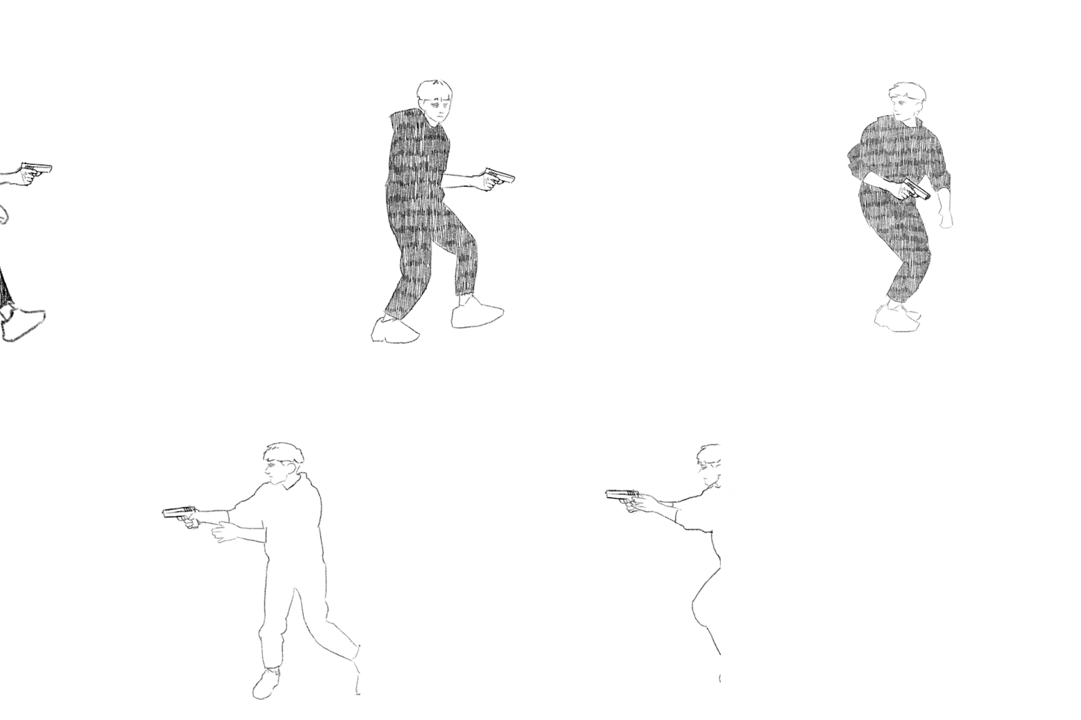
During the morning we went to the photography department of the school where we would start the day off there by filming our own footage to rotoscope later on. There were no restrictions as to what we were allowed to do in front of the camera and green screen, but we had to move from one side of the screen to the other. I decided to go for a gun man or James Bond type of vibe. I didn’t want to just do a simple walk or run cycle, but instead I wanted to challenge myself a little. I did this by sneaking into frame, holding my hands up as if I was holding a gun (this added a prop that I would have to draw form scratch during the process of rotoscoping) then doing a turn and running back out the frame. When recording the clips in the green screen room, I also decided to turn around and then turn back while moving to add to the difficulty of animating everything together. This is how both of them turned out:

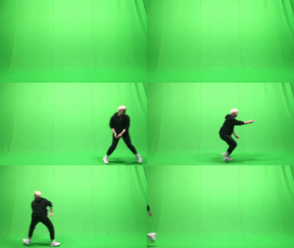
I decided to go with the first of the two clips for my rotoscope. I did this simply because of the turn being slower and therefore making it more challenging to animate the gun to follow the movement in such a way that it won't look “out of place”.
I didn’t find the time during college hours to actually do the rotoscope for this, so I did it at home using my own program (Krita) and my drawing tablet.
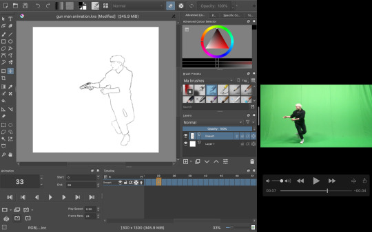
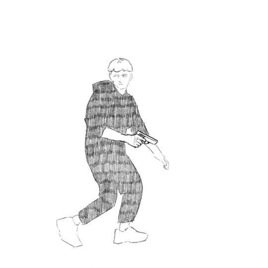
The process was relatively simple; I took the video and took a screenshot of each frame as I went, dragging the screen grab onto the canvas and began tracing my figure. As I went, I also drew in the gun for each frame, lining it up with the position with my hands.
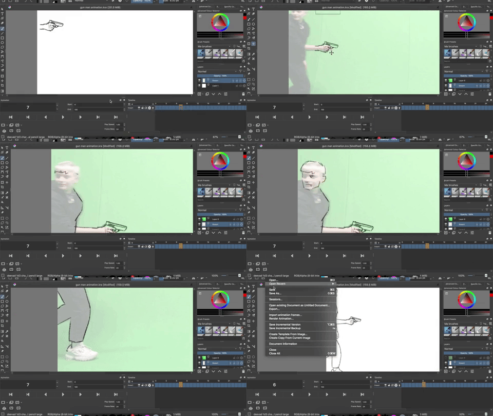
To keep the appearance of the gun consistent I copied most of the frames, up until I came to the part where I had to change the perspective of which the gun is seen from (during the turn).
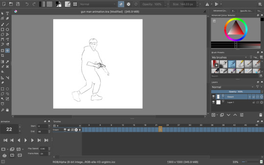
Once I had finished the whole rotoscope this is what I was left with:
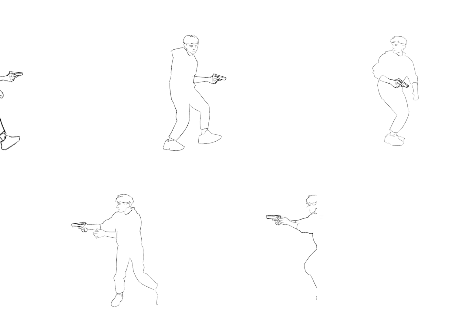
The finished amount of frames came to 66. Quite a high number for such a short animation, but I didn’t want to take away from the fluidity and smoothness. Now I could have just left it here, but I wanted to do some more experimenting. I tried out filling in the clothes with some texture to create a more interesting looking sequence, but half way through I decided to go back to the original linework since I just wasn’t happy with how it was turning out, but here was that in motion:
Instead I did a bit of brainstorming, thinking about what I could do to improve what I had already made. Here’s the mindmap of the brainstorm that I did:

So as you can see, I ended up wanting to experiment with depth, leading me to be doing something to the background. Most of the mind map is based off visual language. I found using this as the root for my brainstorm really useful due to the way you can interpret each term differently to whatever the context is. I will definitely be doing this again and experiment with it further in the future.
I had also settled on wanting to keep it monochrome (misspelling in mind map) and more specifically drawing towards the style of the classic black & white manga comic book style. Based on this, what immediately popped into my mind was this program I recall trying out years and years ago called Medi Bang Paint Pro, or as I think it was used to called; Medi Bang. I was probably around 12 or 13 when I first downloaded it, but I didn't know what I was doing what so ever, so I quickly gave up. For a long time it wasn’t compatible with Mac up until recently; so I decided to take a shot and download it again. The program is free; but that wasn’t the main reason to why I wanted to try out this program again in particular. It has a lot of great tools for drawing and building comic pages, and I thought “What would it look like if I made a background inspired by traditional manga?”- so that’s what I did.
I wasn’t sure if I was going to be able to pull it off at first, so I did a little test run beforehand and I really liked the result:
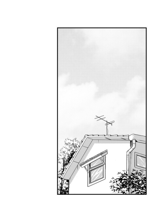
So the way that I did this was by taking a picture (that I unfortunately have lost now) and then proceeding by changing the levels of the picture, playing around with it until it’s primarily just blacks and whites. With a brush tool I began cleaning everything up a little by either erasing unwanted bits or adding additional linework just to emphasise on the subject and shapes within the drawing. I added leaves and other vegetation with some pre-made brushes that came with the program. The last step was to add a screentone of a clouded sky to add a bit of texture, shading and general interest to the whole piece, and voila! Done. This technique is super quick and efficient for creating backgrounds for comics of this style, though I still prefer when everything is painted by hand. The screentone has a very recognisable style to it and is quite often used in manga’s. One of the ones that come to mind for me is Berserk. I have always loved the artwork of that comic series; it’s the kind of art that you could stare at for hours on end and not get bored with. When looking at the artwork from the series, you can clearly see the technique of screentones are being used to create a lot of additional detail to each panel.
Here are some examples of some screentones:
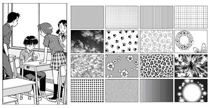
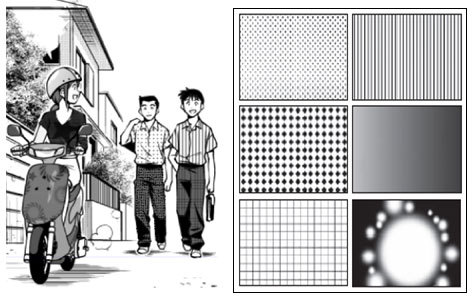

In this example, it has been used for the background. A screentone with blobs lightly shaded has been added to almost create some sort of mist, changing the whole mood and feel of the panel very effectively.

Like mentioned before, in Berserk, the screentones are mostly used as an extra bit of atmospheric detail, rather than being used for any of the shading which is all hand drawn. In this example, it has been used for the lettering/type and again for the background. It creates a gritty and sort of dirty effect, emphasising how he is in a battlefield with monsters around him; definitely not a place you could call “clean”.

In this example, different kinds of sceentones have been used in each panel. In the panel to the left, the opaque stripes are a type of screentone very often used to indicate either speed, focal point or action of some kind. Not only that, but at the bottom of the panel a softer pattern of screentone has been used to create the look of dirt or sand, again with a gritty texture to emphasise on the fact that the character, Guts, is inferior at this moment.
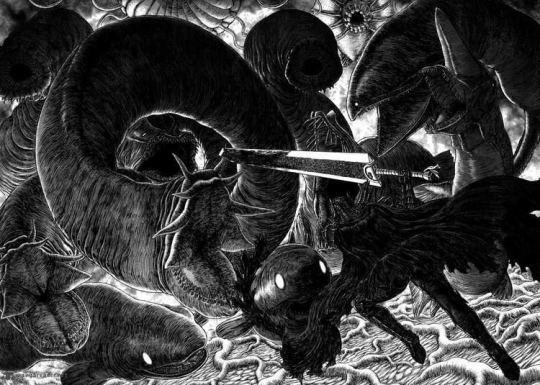
In this super epic and intense illustration, you can again see the great use of screentones, most notably used for the background yet again. It really helps to create a strong feel to each illustration. The use of tone is especially important in manga or comics, since it so often is done in just black & white, so you have no use of colour; this is where screentones come in as a great tool to use for just this.
So, with all of this brainstorming and researching done, and by using the same technique as I did when doing the “test”, I began drawing. I used this picture which I recall taking somewhere on the border to Germany as the base image:

I chose this because it has that “street” vibe to it, which I thought could be cool with the whole theme of “gun man”. Very edgy, very edgy indeed.
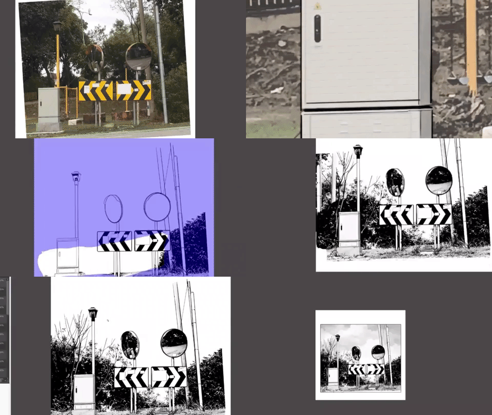
This gif above shows loosely the process of the piece from start to finish. It was mostly just me playing around and figuring out all the tools of the program, but it was quite fun to put together.
With the background now complete, I put it into my rotoscope, went over each frame and painted the shape of myself in the animation white and was finally finished with the final rotoscope; being the third version or option that I did.


I am very happy with how it turned out in the end, and I have definitely learnt masses with this exercise of rotoscoping something that that I have filmed myself. I think if I were to further improve on this, I’d definitely consider animating the background itself (birds flying or leaves rustling), or maybe even try shading the subject somehow, taking inspiration from manga’s such as Berserk or any of Junji Ito’s work.
I decided to try out asking a few of my peers in the class what their opinion was on the final rotoscope. The feedback that I received was purely positive; the people I asked said they couldn't think of any particular way of improving the finished product. They said it both looked great as well as it answered what the task was questioning and challenging us to do.
To me, this really shows and proves that the work I have done here is successful work that I can be proud of and take what I have learnt through doing this task with me for the future, without doubting if what I have learnt is of quality.
✄┈┈┈┈┈┈┈┈┈┈┈┈┈┈┈┈┈┈┈┈┈┈┈┈┈┈
As a little extra note, here are the same frames (frame 23) in the three different versions:


4 notes
·
View notes
Note
Hey guys! Can y’all give me some tips on which art program works best? My current program crashes every 20 minutes or so and I’m ready for a change 😂

Programs to talk about:
Firealpaca
Free
Excellent animation tool
Onionskin mode for animating
lightweight program
Basic how to use link
Animating in firealpaca link
Krita
Free
Did not work well on my machine
https://www.youtube.com/watch?v=TB6ig9dM4Uw
Medibang
Free
PC and app versions
Basically Firealpaca’s twin without animation
Designed more for Manga/Comics - has options for preset comic panels, action lines, etc which you can directly use
Has gaussian blur
Able to punch zoom on touch screen devices
More features, options, and ability to customise than Sketchbook. Suitable for a mid-level digital artist as its wide range of features will be overwhelming and hard to grasp for someone new to digital art
Photoshop
Paid (subscription based)
has gaussian blur
animation option
custom brushes / brush sets
highly versatile layer mask tool
small 3D engine on newer versions ( photoshop CC )
rudimentary perspective transformation tool
No brush stabilisation built-in pre-CC
Sai
Paid
does not have gaussian blur
no animation options
Has Brush Stabilisation built-in
Good painting brushes
No pinch zoom/rotate :/
Sai Basics link
Clip Studio Paint (sometimes known as Manga Studio 5)
Paid but goes on sale for 20USD every few months
Has gaussian blur; good blend between Sai and Photoshop
Able to animate (Limited in Pro to 24 frames, not in EX)
Good brush engine + pen pressure, especially for painting. Also has adjustable stabilizer
High availability for custom brushes
CSP Basics tutorial
Autodesk Sketchbook
Free
Pc and app versions
Simplified interface
Pro: really good for the beginner digital artist. Simplified interface means that it’s easy and intuitive to pick it up and start creating art. There’s a bit of a learning curve, but nothing nearly as steep as a medibang/photoshop curve. They have a large, free bank of brushes available from their official website, so you won’t need to mess around with brush creation.
Con: missing a lot of vital things an intermediate/advanced digital artist would want. Mod Seraph uses a surface pro and can’t flip the canvas on the app store version, which is very annoying because she can’t check how her faces/poses look as she draws them). The big bank of brushes is nice but nothing life-changing. You can get a lot done with just a basic round brush, and art programs typically let you create your own brushes anyway
Smooth pinch zoom and rotate
Sketchbook Pro beginners guide
I recommend starting off with Sketchbook if you’re new to digital art or unsure of where you stand in terms of your familiarity with different digital art programs. Once you get familiar with Sketchbook and start running into issues where you’d like changes or optimisation with regard to your digital art software (ex: you get frustrated at certain roundabout ways which you have to do things and you think “there’s got to be something else I can do”), then move into the Sai/Photoshop/Clip Studio Paint/Medibang/Firealpaca family. These programs have a large base of users which use them. So, if you get stuck, you can reach out to other users or google for help and actually get solutions to your problems. After you get familiarised with one or more of those programs, you can start playing around with Krita/Gimp/etc, as they have smaller followings and so cannot provide as much help if you’re new to digital art software and thus have no experience with troubleshooting its problems. However, they can still be good software and may be better suited to you as an artist so I’d advise giving them a shot because you might click with one of them very well
- Mod Seraphtonin (ko-fi)
if you’re more experienced in art or are trying to focus on Digital Paintings or Comics I absolutely recommend paying the $20 for Clip Studio Paint when its on sale. It’s an extremely versatile program comparable to phtoshop but with better ease of use and works fine on less powerful computers. If how ever you want to try animating, firealpaca is my recommendation, the tool is well built for animating in and its free!
- Mod Pixielart (Ko-fi)
311 notes
·
View notes
Text
My Experience Switching to Linux as an Artist
I've been running Linux as my primary OS since October of last year. I started doing it in response to my frustrations with the Wacom tablet driver dance many Windows artists are likely familiar with: the one where you spontaneously lose pressure sensitivity, and have to turn the Wacom Professional Service off and on in the Task Manager's Services tab before it starts working again -- or you delete all tablet preferences, or you uninstall/reinstall the drivers, or you edit a .ini file, etc, etc. It had gotten to the point where pen input would suddenly stop without warning and not reliably respond to the service restart nor a driver reinstall, and at that point I decided I'd had enough.
Ubuntu Linux has no official Wacom driver; instead, it has a community-written driver called xSetWacom, from the Linux Wacom Tablet Project. I ended up trying a few Linux distributions before finally settling on Linux Mint with the Cinnamon desktop environment; every last distro interfaced with my tablet without any issues whatsoever, and I've never had to do anything even remotely resembling the aforementioned service-restart process. You can find a more detailed breakdown of my experience (including pros and cons) after the jump.

Now, there are a few drawbacks and growing pains to this, and it'd be unfair if I didn't name them:
Linux didn't interface with my hybrid graphics card properly when I first installed it; there were massive screen tearing and battery drain issues before I went through a guide that helped me tell Linux to exclusively use the integrated Intel graphics for video output. It's no big deal, since I'd have had to boot into Windows to play the 3D-intensive games I’m interested in (like Planet Coaster) anyway.
Only one of the distros I’ve tried (Elementary OS, which I switched away from for processor heat/stability reasons, but kept the look of to the best of my ability after I switched) was able to recognize tablet input through Bluetooth, so I currently only use my tablet in wired mode.
Configuring the tablet's buttons through Linux requires me to run a series of command-line arguments that clear and reassign commands every time it’s plugged in; I wrote a script file to do this (visible as a desktop shortcut in the dock in the screenshot above), and once clicked, it runs in a fraction of a second. Figuring this out was a process of trial and error, but now it's a single-click action, and I do it without thinking about it.
Learning to do the same things you did in Windows (including basic installation of some programs) can often require you to become familiar with the Linux command line, or to search the Internet for answers to obscure problems. This took me some practice to get used to.
The big one: Virtually no major Windows art programs have Linux versions. Many open-source advocates will point you to GIMP, but the UI for that is the clunkiest thing I've ever seen, and it's never appealed to me at all. I personally use Krita, which is a more than functional free alternative to Photoshop. (It's also supposedly possible to run Paint Tool SAI in WINE, though I've had no luck with this.)
And here are some of the benefits I've encountered:
As mentioned, I no longer encounter any of the stability issues you get from Wacom drivers. This is a must for someone like me, whose creative ability thrives on the ability to maintain flow without being interrupted. (It was nice seeing that I’d avoided the recent issue where Wacom drivers inserted straight lines into curved strokes, also.)
Linux doesn't advertise to you; it doesn't collect data from you; it doesn't attempt to push Cortana or Microsoft EDGE on you; it doesn't restart to apply automatic updates without your explicit permission. It does what any OS should do: it launches and multitasks programs without itself getting in the way.
There are functional, user-friendly apps for doing just about anything you might want to do on your PC, and they're all free and available on the Ubuntu Software Center app. It's a different feeling from the Windows, iOS, or Android app stores, in that very few of the apps available are for-profit ventures; in most cases, they’re either community-funded or just freeware. The landscape of apps available has changed greatly from how things were a decade ago, so if (like me) you were disheartened by Linux's lack of user-friendly programs back in the mid-'00s, it might be worth another look.
Your mileage may vary on this, but for me, as an artist, it's amazing to finish a creative work, sit back, and realize that the thing you made was made exclusively with software anyone can download for free. I especially get this feeling from my work in Blender, which I don't even use my tablet for.
Despite being something I had to settle for, Krita is still very good; it's not quite SAI or Clip Studio Paint, but it is fully-featured, it has a wide variety of useful brushes and features (I'm especially excited for the Colorize Mask tool in 4.0), and getting used to it was one of the best choices I've ever made as an artist. (If you'd prefer not to switch to Linux, it's available for Windows and Mac as well.)
Linux absolutely isn't for everyone in its current state, and I certainly know that some Windows-exclusive programs are either too much of a pain or outright impossible to give up in many situations, but if you think you might benefit from it: it's free, you can try it (by running off a live USB stick) with little to no hassle, and I do recommend it. In addition to Linux Mint, recommended distributions include Lubuntu (which I use on my netbook), Xubuntu, and Ubuntu proper. If you’d like some more perspective from an artist who uses Linux exclusively, I recommend the blog posts of David Revoy.
Here are a few of the programs I use (most of the dock icons in the screenshot above are custom):
Program manager: Cairo-Dock (heavily tweaked) Web browsing: Firefox, Chrome Password management: KeePass Email: Geary Messaging: Telegram Desktop, Discord Music: Quod Libet Video playback: VLC Text editing: Focus Writer, Geany Art: Krita, Aesprite 3D: Blender
7 notes
·
View notes